Tips for a strong homepage on your website
Nowadays it is very easy to create your own website. Thanks to WordPress and a whole host of themes or builders, almost anyone can build their own website. That’s really super nice and I definitely welcome that. Only thing is, a website that is built well can actually get more results. So sometimes it’s also wise to take a moment to have someone who has done this before look at your website and optimize it. You really don’t always need a very expensive new website right away. In this blog, I will give you some tips for a strong home page, what you can do yourself to improve your website and give some great examples of websites that have been optimized.
Useful tools for your website
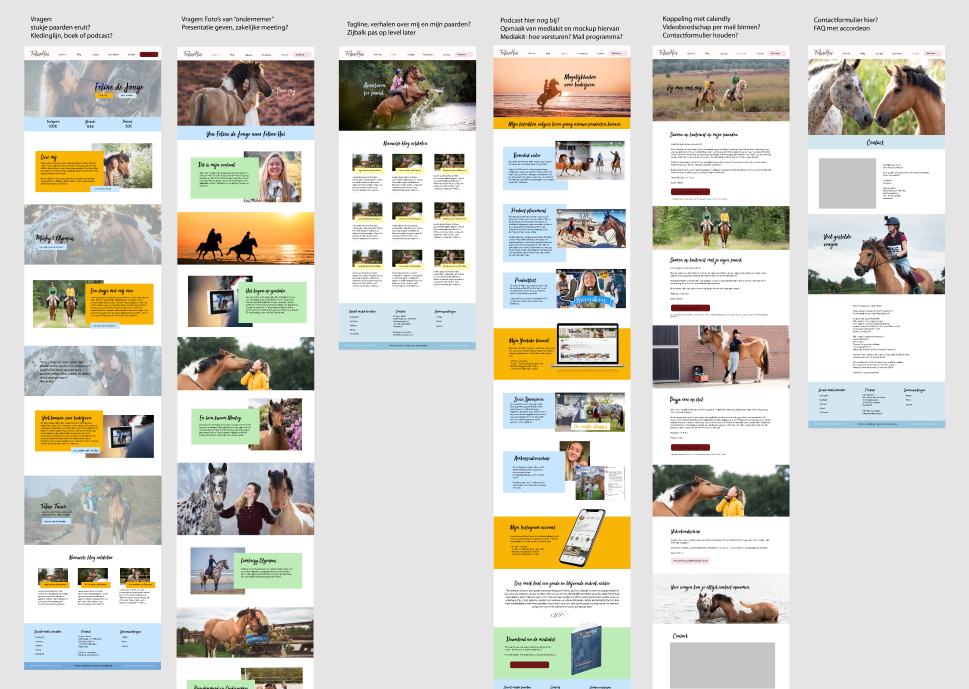
Your website grows over time and you add pages. To keep track, it can help to occasionally take a moment to map out what pages you have and what can be seen here. For this, for example, you can very easily take screenshots of the whole page (I use the Awesome Screenshot extension tool for Chrome or Firefox for this) and put them side by side in the Figma tool. That way you can immediately see what is clear and what page might need to be taken out or created new. If you want to design new pages, that can also work very nicely in Figma because you can design faster than you could in WordPress. Important to know your template’s options, though.
3 ingredients for a good homepage
A long time ago I did a promotion on Facebook where you could send me your website and I gave 3 tips on what you could do better here. Funnily enough, most of the websites of equestrian entrepreneurs showed the exact same things. And that’s a shame, because often you can really improve the website with a few tweaks.
There are actually three very important ingredients for any home page. By the way, it doesn’t really matter what website template you use or what industry you’re in. These things are always important:
1) that your value proposition or USP is always at the top of the page
2) That you provide access to more information in a fun way
3) that you make it safe to explore the site without wanting to sell right away
So it is super important that you have caught your website visitor’s attention immediately. In addition, clear navigation is very important! You don’t have to put all the details of your business on the homepage (preferably not even!), but it should be very clear that this information is there and where people can click through to it.
And finally, you must make the website visitor feel “safe.” It is very unlikely that someone is going to buy something from you right from the first time of viewing your website. Give someone time to “get to know” and discover the product or service you offer. So don’t put a “buy” button at the top of your home page.
More tips
1. Do not welcome people
Often you still see “Welcome to this website” on the home page. That’s a waste of your visitor’s time actually. Because by reading this sentence, he has not yet learned anything about you or your services. Recall that a website visitor spends between 5 and 10 seconds deciding whether this website can take them further. So you would much rather he read your value proposition or unique selling point at this time than read a sentence that should have made him feel welcome. Through layout and clarity, make people feel welcome on your website. But don’t waste your visitor’s time by writing that down verbatim.
2. Supplement text with images
Some people like to read, others are more visual. It depends a bit on our preferences, but also on how much time we want to spend figuring something out. On your website, therefore, try to serve both types of website visitors. Therefore, always try to supplement the text with images as well. Often an image gives the visitor an idea of what it will look like when they go to buy your product or use your service. So besides telling how well you can teach, for example, and what you pay attention to in your classes, it’s nice if people can also see a picture of how you enjoy teaching.
3. Provide a varied layout
We often want to provide quite a bit of information on our website. But if you look at your own Internet usage you know that to read large chunks of text you really need to take some time. Likewise for this blog. Chances are you’re not going to read these spontaneously in between but rather scroll through them first – is this interesting? And only if the answer to this is yes then take a moment to really read. Exactly this also happens with a website. Therefore, you want to make your story easy to absorb, and so you do that by playing with blocks and layout on your website. Sometimes you put something in a block of text, then you use bullets again, and you put different things in different-looking blocks. That way, you make your website scannable and motivate people to read.
4. Also, always check everything mobile
On most websites, mobile traffic is between 60-70% of all visitors. So making your website look good on mobile is hugely important. And yet many websites are built for desktop and never viewed on mobile. So anytime you get started with your website, it’s important to open it briefly on your mobile (and perhaps tablet) as well. Then you will get a good idea of how all visitors see your website then. After all, it’s a big waste to have people come to a beautifully formatted page that doesn’t work at all on mobile.
Website tuning
Now you can already improve a lot yourself with these tips. But sometimes it’s not a crazy idea to have someone with you who knows just a little bit more about it. So a while back I did a redesign of the homepage and training pages for Academy Horse & Dog, improved the website in the current template for TheHorsupCompany and created a page for Celine van der Stroom to sell her training rope. All without touching the design of the website and just within the capabilities and hours that the entrepreneur wanted to spend on it.
Of course we discuss in advance what is realistic but usually this can be done in as little as 2 or 3 hours for one page. A top solution when you have no time or no idea how to tackle a particular page. Please get in touch if you are interested in this.
Good luck again!

